lunes, 21 de enero de 2013


Hay dos teorías que definen que es un color, una que en simples palabras dice que el color es luz y la otra que afirma que se trata de pigmentos y tintes. Como este blog no pretende aburrirlos con la explicación extensa de este tema, vamos a pasar al punto del post y tomar al color como la tonalidad que captan nuestras retinas.

De acuerdo al gran pintor de arte abstracto Vasili Kandinsky, los colores no son algo tan simple como parecen. En su libro "Sobre lo espiritual en el arte", el cual leí hace bastante (profe, si lee esto no me mate si meto la pata), desarrolla un análisis que en simples cuentas explica las distintas sonancias y la multiplicidad de dimensiones que tiene algo que para tantos es algo muy simple.

El diseño gráfico no es el único que exprime la esencia de los colores para aprovechar su potencial al máximo, porque un fondo rojo no se elige asi porque sí. Aunque no lo crean, los colores nos influyen y vulnerabilizan, logrando que tarde o temprano los utilicemos para reflejar una sensación o un estado interno.

La moda es básicamente lo mismo: vestimos lo que somos y llevamos los colores y las formas de acuerdo a como nos sentimos y lo que nos pasa o influye nuestra mente. ¿Alguna vez te pusiste a pensar por que elegiste ponerte lo que llevás encima? A continuación, un breve resumen del significado de los colores y una invitación a empezar a conocerte más de acuerdo a lo que vestís.

There are two main theories about the definition of the word colour. While the first one says that color is light, the other one afirms that color is about pigments and dyes. This blog doesn't want to bore you with an extensive explanation about this subject so where gonna go straight to the point of this post and take color as the tone that our retinas capture.

According to the well-known abstract art painter Vasili Kandinsky, colors aren't as simple as they seem. In his book 'Concerning the Spiritual in Art', a book that I read a long time ago (If you read this, Professor, don't hate me for remembering so little details), he explains the different resonances and multiplicity of dimensions that something that is so simple for everybody has.

Graphic design isn't the only one that exploits the essence of colors to take advantage of its potential because choosing that something is gonna be red it's now just a random decision. Believe it or not, colors influence us achieving that sooner or later we end up using them to reflect an emotion or feeling.

Fashion is basically the same: we are what we dress and wear colors and shapes according to how we feel or what happens in our minds. Have you ever stopped to think why you are choosing to wear what you have on you? Next, a brief summary of significance of colors and an invitation to start to known you more according to what you wear.


BLANCO | WHITE


Es un color que está asociado a la luz y a la luminosidad; a la limpieza y a la claridad, a la pureza y a las causas positivas. Es activo, positivo, es dinámico y estimulante. El blanco sugiere paz, sosiego, armonía, calma. Es un color optimista y espiritual.

It's a color that is associated with light and brightness, to the cleanliness and clarity, purity and good causes. It's active, positive, dynamic and stimulating. White suggests peace, tranquility, harmony, calm. It is optimistic and spiritual.


NEGRO | BLACK


Es un color que asociamos con la noche, lo que resulta desconocido y tenebroso. Refleja emociones negativas, la depresión, el encerrarse en sí mismo. Es pasivo, negativo, creador, es la raíz terrestre de lo infinito, el no manifestado, lo inexplorado. Representa la noche cósmica, el misterio de la encarnación, lo abstracto.

It is a color that we associate with the night, which is unknown and scary. Reflects negative emotions, depression, withdrawing into himself. It is passive, negative, creator, it is the root of infinity, the unmanifested, the unexplored. Represents the cosmic night, the mystery of the incarnation, the abstract.
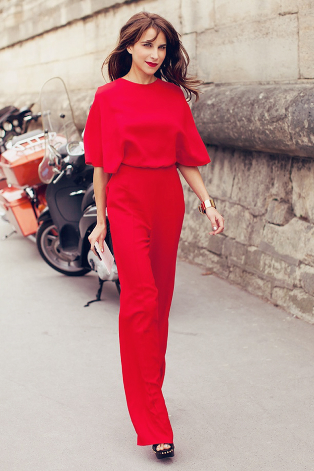


ROJO | RED


El color rojo promueve la objetividad, con lo cual permitirá el correcto discernimiento, evitando divagar en lo superfluo, para ir directamente a lo importante. Es el antídoto perfecto contra el temor y la timidez. El rojo se asocia con la sangre, la violencia, la sensualidad, la vitalidad, los sentimientos intensos de amor, de rabia o cólera. Es un símbolo de guerra y también de vitalidad.

The red color promotes objectivity, which allows a correct discernment, avoiding superfluous wandering to go directly to the point. It is the perfect antidote to the fear and shyness. Red is associated with blood, violence, sensuality, vitality, intense feelings of love, anger or rage. It is a symbol of war and also vitality.


VERDE | GREEN


El verde es una vibración de armonía y de equilibrio. Es un color tranquilizante, asociado a la naturaleza, es el color de la vida, sin embargo simboliza los celos, envidia. Desde el punto de vista psicológico, el verde es un color de paz y equilibrio, mucho más que el blanco, y es por ello el color preferido en hospitales. Neutraliza el rojo de la sangre.

Green is a vibration of harmony and balance. It's calming, associated with nature, it is the color of life, however symbolizes jealousy, envy. From a psychological perspective, green is a color of peace and balance, much more than white, and is therefore the preferred color in hospitals. Neutralizes blood red.


AZUL | BLUE


Este color lo asociamos con la frescura del cielo y el mar. Con las alturas y las profundidades. Asociado al refinamiento, melancolía y la poesía. Una persona que le guste mucho el azul, puede tener un temperamento nostálgico y romántico, lleno de sensibilidad y equilibrio, lealtad hacia los amigos, conciencia del trabajo y de la vida. Es el color de la confianza.

We associate this color with the freshness of the sky and sea. With the heights and depths. Associated with the refinement, melancholy and poetry. A person who likes a lot of blue can have a nostalgic and romantic temperament, full of sensibility and balance, loyalty to friends, aware of the work and life. It is the color of confidence.


martes, 7 de agosto de 2012


El Bata Shoe Museum, ubicado en Toronto, Canadá, colecciona, investiga, preserva, restaura y exhibe calzado de todas partes del mundo. Ofrece 4 exhibiciones, tres de ellas son de tiempo limitado, así como charlas y eventos. La colección de este peculiar museo tiene mas de 10.000 pares desde la antigüedad hasta el presente, y es probablemente el único museo dedicado exclusivamente a la historia del calzado.

Empezando por las botas plateadas de Elton John, pasando por antiguedades de Roger Vivier y terminando con calzado de edición limitada de famosos diseñadores, creo que este es el lugar en el que quiero ser enterrada. ¿Qué es mas espectacular para una mujer que un edificio entero lleno de zapatos? Este lugar es como la Iglesia para cualquiera de nosotros, los que amamos la moda, ¿no?

The Bata Show Museum, located in Toronto, Canada, collects, researches, preserves, and exhibits footwear from around the world. It offers four exhibitions, three of which are time-limited, as well as lectures and events. The collection contains over 10 000 items from throughout history, as well as the present, and is the biggest and perhaps the only museum in North America dedicated solely to the history of footwear.

Starting with Elton John's monogrammed silver platform boots, going through Roger Vivier antiques, and ending with limited edition footwear from well-known designers, I think that's the place I want to be burried in. What is more breath taking for a woman than a whole building filled with shoes? This place is like church for any of us, fashion lovers, right?
Estoy enamorada de este par:
I'm in love with this pair:

miércoles, 18 de julio de 2012


Andre De Freitas es un increíble fotógrafo e ilustrador con un título en Animación por Computadora. En su página web define su estilo de la siguiente manera: "El concepto de la quietud capturó mi imaginación y me concentré en la ilustración. En vez de dibujar, traté de imaginarme sacando fotos de mis temas. Así, la ilusión de inmovilidad sería un poco más creíble, casi como una fotografía. Luego de eso, mi inserción en el mundo de la fotografía fue casi por instinto."

Andre De Freitas is an amazing photographer and illustrator with a Bachelor’s Degree in Computer Animation.. In his website he says this about himself: "The concept of stillness captured my imagination, and I focused more on illustration. Instead of just drawing, I tried to imagine myself taking photos of my subjects. That way the illusion of stillness would be a little more believable, almost like a photograph. After that, my insertion into the world of photography was almost based on instinct."

lunes, 2 de julio de 2012


Este pasado 24 de Marzo en el centro de Manhattan, se inauguró la exposición The Little Black Jacket: Chanel’s Clasics revisited by Karl lagerfeld & Carine Roitfel. Esta muestra es una celebración de la elegancia atemporal de la chaqueta negra que inventó Coco Chanel como una pieza clave de sus colecciones. Y, hasta la fecha, lo sigue siendo.

La exposición muestra 113 fotografías de celebridades y figuras icónicas usando esta prenda, cada una de una manera distinta. Entre ellas se encuentran personalidades de la talla de Sarah Jessica Parker, Anna WIntour, Kirsten Dunst, Uma Thurman, entre otras tantas celebrities. Cada foto fue tomada por el propio Lagerfeld, quien es más que un aficionado al arte de la fotografía y los cortometrajes. La muestra cerró pocos días despues, pero ahora se materializará en un libro con todas las imagenes que participaron de ella.

Personalmente, me encanta la visión de Karl de simpleza y minimalismo, y que mejor manera de mostrar la increible campera Chanel que hacerlo con fotografías de composición simple, pero efectiva.

This past March 24th in downtown Manhattan, the exhibition The Little Black Jacket: Chanel’s Classics revisited by Karl Lagerfeld & Carine Roitfel was launched. This exhibit its an ode to the timeless style of the black jacket that Coco Chanel created as a key to her collections. And up to this date, it remains being in.

The exhibition shows 113 photographs of celebrities and iconic people wearing this piece, each of them in an unique way. Between the muses were people like Sarah Jessica Parker, Anna Wintour, Kirsten Dunst and Uma Thurman, amongst many others. Each photograph was taken by Karl himself who is more than a fan of the photography and long footages. The exhibition closed on June 15th but now it is being transformed into a book with all the images that participated in it.

Personally, I love Karl's vision of minimalism and simplicity, and what a better way to show the amazing Chanel jacket that with photographs with simple yet effective composition.


Podés ver el resto de las fotos en la web de The Little Black Jacket.

You can see the rest of the photos in the The Little Black Jacket website.

martes, 12 de junio de 2012

Roberta Marrero es una diseñadora publicitaria que se ha dedicado a la interpretación, la música, la pintura, la escritura, y por sobre todo, la ilustración. En su condición de transexual llega para borrar los prejuicios, expresando toda su creatividad en distintos campos para demostrar que el artista simplemente es, no importa qué.

Mirá más de su increible trabajo en este post.

Roberta Marrero is an advertising designer who has devoted her creativity to the arts; music, painting, writing, and especially, illustration. As a transsexual she presents herself, expressing her artistry in different fields to show that the artist simply is, no matter what.


See more of her incredible pieces in this post.

jueves, 7 de junio de 2012

Maria Björnbom-Öberg es una talentosísima tatuadora que descubrió a los marcadores como el mejor medio de creación de dibujos de alta calidad para reflejar el contraste de las agujas sobre la piel. La  translúcida y superior calidad de los marcadores Tria probaron ser la herramienta perfecta para darle a los clientes una mejor interpretación de como el arte de María quedaría una vez finalizado en su piel.

Mirá el resto de las fotos de las creaciones de Maria en este post.

Maria Björnbom-Öberg is a highly talented Tattoo artist who discovered Tria Markers as an ideal medium for creating high quality sketches to best reflect the flat finish of needle on skin. The translucent, superior quality of Tria markers proved to be the perfect tool to give clients a better understanding of how Maria’s artwork would look in a finished stage.

See more photos of Maria's sketches in this post.

 
Design by Main-Blogger and Blogging Stuff - Modified by Delfina Savoretti
Coolsario Blog | Copyright © 2012.