jueves, 3 de enero de 2013


Pantone Inc. es una empresa con sede en Nueva Jersey (Estados Unidos), creador del Pantone Matching System, un sistema de identificación, comparación y comunicación del color para las artes gráficas. Su sistema de definición cromática es el más reconocido y utilizado por lo que normalmente se llama Pantone al sistema de control de colores.

Desde el año 2000, el instituto Pantone realiza una exhaustiva investigación que abarca todas las áreas del diseño, de la moda a los accesorios de todo tipo; del diseño de ambientes a eventos deportivos para elegir un tono que represente el año venidero. “Es el tono más común en la naturaleza, el ojo humano ve el verde más que cualquier otro color”, argumentó Leatrice Eiseman, consultora de color y directora ejecutiva del Pantone Color Institute sobre la elección de este año: El esmeralda (Emerald, en inglés).

¿Será casualidad que el afamado buzo de Kenzo que fue un éxito entre personalidades de la moda haya sido verde? A continuación, ideas para aplicar el color del año a nuestro guardarropas.

Pantone Inc. is a company located in New Jersey, USA, that created the Pantone Matching System, a system of identification, comparison and comunication of color in graphic arts. Its system of chromatic definition is the most used and recognized in the world.

Since 2000, Pantone Institute goes through an exhaustive research in fields of fashion, accesories, art, interior design and even sports to choose a color that represents the year that will come next. 'It's the most common tone in nature and the human eye sees green more than any other color', said  Leatrice Eiseman, color consultant and executive director of the Pantone Color Institute on the choice of 2013's color: Emerald.

Is it just a coincidence that the most iconic piece of clothing of 2012 (the Kenzo sweatshirt) was green? Next, some ideas to apply this shade to our wardrobe.

martes, 16 de octubre de 2012


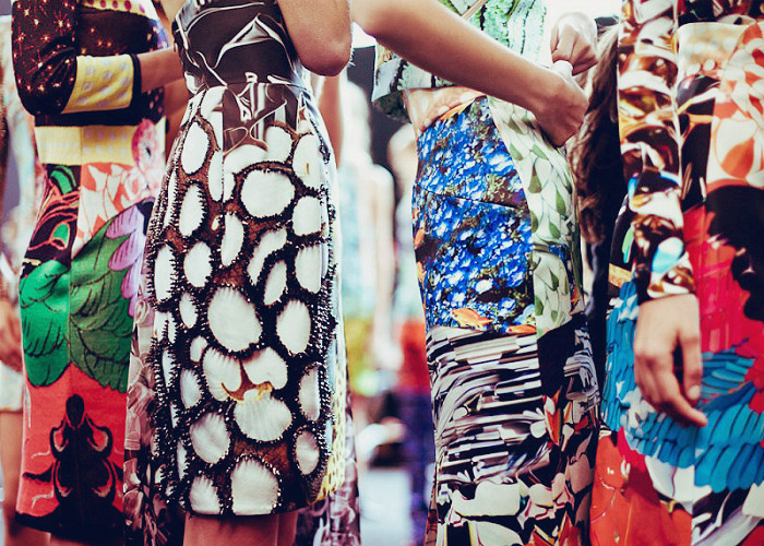
Las impresiones digitales siempre existieron en el mundo de la moda pero hoy en día, gracias a los avances en la tecnología, ya no existe límite para lo que te quieras poner encima. Recién bajado de la pasarela, los diseñadores están invadiendo editoriales y fotografía con llamativas y vibrantes estampas que pueden mantenerte despierta solo de mirarlas.

Pero hay un nombre que se destaca de entre todos ellos: Mary Katrantzou. Ella es una diseñadoira griega que ha explotado esta técnica y es ahora la reina de ella, resaltando de entre los grandes nombres de la moda, celebridades y socialités. Mary ha basado sus colecciones en botellas de perfume, vidrio soplado artesanalmente, pinturas de la sociedad del siglo 18 e interiores, siempre manteniendo la estampa a su estética.

Es matemática pura: colores brillantes mas morfología compleja, da por resultado increíbles estampas.

Digital Prints have always existed in the fashion world but nowadays thanks to the technology advances there is no limit for what you want tol put on you. Down from the runway, the big designers have been invading the spotlight all around the world with bold and vibrating prints that can keep you awake for days just by looking at them.

But there's a name that stands out in between them all: Mary Katrantzou. She is a greek designer that had embraced this technique and is now the Queen of it standing out from all the big names in fashion, celebrities and socialité. Mary has based her collections on perfume bottles, artisan blown glass, eighteenth century society paintings, and interiors while keeping the printed image central to her aesthetic.

It's simple math: bright colors plus complex morphology equals amazing prints.

(Left: Proenza Schouler // Right: Mary Katrantzou)

(Mary Katrantzou for TopShop)

(Gwen Stefani for Elle in Peter Piloto Top)

lunes, 10 de septiembre de 2012


Como les contaba en el post de Gaby Herbstein (a la que le puse demasiado expectativa y salí con una expresión neutral de su conferencia), el jueves asistí a este ciclo de charlas sobre comunicación, publicidad y diseño que se organiza en mi hermosa ciudad desde hace ya 6 años. Para mi es un estilo de cábala ir (ya voy por mi 3ra vez seguida) y siempre disfruto a full de la cansadora y larga jornada. Una de las cosas más lindas de este día es pasar los recreos entre conferencias bajo al sol, junto al río ya que el evento se aloja en el CEC (Centro de Expresiones Contemporáneas), el cual tiene sus galpones dedicados a distintas actividades separados durante un largo tramo de la rambla del río Paraná. Peeeeeeeero, este año el clima no ayudó en nada y, desde la lluvia que nos acompañó mientras hacíamos la cola para entrar hasta la extrema humedad a la que ni los alisados resistieron, colaboró en que se haga mas largo todavía.

Los disertantes fueron muy variados en sus ramas y aplicaciones del diseño y la imagen. El mensaje que me llevo mas que nada es gracias a G. Herbstein, que a pesar de que se pasó mas de 2 horas hablando sin cesar de cosas interesantísimas (y algunas no tan inherentes a lo que nos compete), y es que todo se puede. Con determinación, muchas fuerzas, garra y los 5 sentidos ciegos a los obstáculos, todo llega. Es muy interesante conocer como arrancó gente como uno y a todo lo que llegó casi por azar del destino. Todavía no me termino de decidir si quiero vivir toda mi vida del diseño, pero esta regla mencionada se puede aplicar a cualquier cosa que se nos ocurra. Hace poco me dí cuenta de la fuerza del poder de la atracción (no quiero delirar mucho con eso ya que en algún momento contaré mi experiencia) y después de esto lo reforcé aún más.

En fin, les dejo algunas fotos tomadas por mi y mi amiga y compañera de sufrimiento matutino Sofi, la cual me dió unas clases de fotografía que tan bien me venían y de las cuales todavía necesito muchas más. ¡Me vas a sacar buena, lo prometo!

As I told you previously in Gaby Herbstein's post (whom I had too many expectations in and left the lecture with a neutral feeling about it), this thrusday I went to this event of lectures dedicated to Communication, Advertising and design held in my lovely city since 2006. For me it's kinda a lucky charm to assist (it's my third time in a row this year) and I always enjoy the exhausting and long day. One of the best things about this event is being able to spend the breaks in between lectures under the sun, next to the river 'cause this event is held at CEC (Contemporary Expresions' Center), which has its  big sheds next to the coast of the Parana river. Buuuuuuut this year the weather didn't help at all and besides the rain in the morning we suffered from the horrible humidity and the day became longer than it was.

The speakers were very different from each other and came from a variety of branches of design and image. The conclusion that I took with me is thanks to G. Herbstein, whom even though spent more than 2 hours speaking of relative and not so relative stuff, and it is the simple idea that everything is possible. With determination, strenght and blind senses to overcome obstacles everything eventually happens. It's super interesting finding out how people like us started and everything they accomplished almost randomly. I still haven't figured out if I wanna live the rest of my life living of design but this rule can be applied to any situation. Recently I became aware of the amazing power of laws of atraction (I don't wanna talk too much about this because at some point I want to tell you my experiencie) and after this, I firmed up my beliefs.

Anyway, here are some photos taken by me and my classmate and friend Sofia, who gave me a few quick lessons about photography that I needed so much and I still do! haha

viernes, 29 de junio de 2012

El desfile de la línea masculina de Moschino Primavera/Verano 2013 es tan poco convencional como de costumbre, con la atmósfera de los supermercados auténticos de Milán, entre los pescaderos y los paquetes de detergente en polvo. Los mismos paquetes de detergente en polvo se encuentran impresos en sweaters, camperas o trajes, un guiño al arte pop y una forma única de hacer frente a la tendencia de los años 60.

"Supermercado, super Moschino", fue el pronunciamiento del proyecto de Bill Shapiro. La audiencia fue acomodada en un supermercado de Milán, entre las frutas, hortalizas, carne y pescado. Él y la matriarca de la marca Rossella Jardini le rinden homenaje, dijo, a "la potencia gráfica de los supermercados". Incluso se animó a recitar unos cuantos slogans de los avisos de los años '50: ¡Garantía de devolución! ¡Sus blancos nunca serán más blancos!

Moschino Spring/Summer 2013 Menswear's fashion show is as offbeat as usual, with the atmosphere of Milan's authentic supermarkets, between fishmongers and packets of laundry powder. The same packets of laundry powder are found printed on sweaters, jackets or suits, a nod to pop art and a unique way of addressing the 60s trend.

"Supermarket, super Moschino," was the pronouncement of Moschino's Bill Shapiro. The audience was assembled in a Milanese supermarket, among the fruit, vegetables, meat, and fish. He and label matriarch Rossella Jardini were paying homage, he said, to "the graphic power of the supermarket." He rattled off a few fifties-style ad promises you might find on the shelf: Money-back guarantee! Your whites will never be whiter!


Design by Main-Blogger and Blogging Stuff - Modified by Delfina Savoretti
Coolsario Blog | Copyright © 2012.